Formatting in Five Lines
- Write the hook for the preview. LinkedIn shows only the first few lines before "see more", so the first one or two lines decide whether the rest gets read.
- Use white space. Short paragraphs, one idea each, with blank lines between them.
- There's no bold button in posts. "Bold text" tools swap your letters for look-alike math symbols, which some screen readers read letter by letter. Use them rarely, or not at all.
- Posts can be up to 3,000 characters. For anything longer, LinkedIn points you to an article.
- End with one clear takeaway and, if you want replies, one real question.
One Post, Before and After
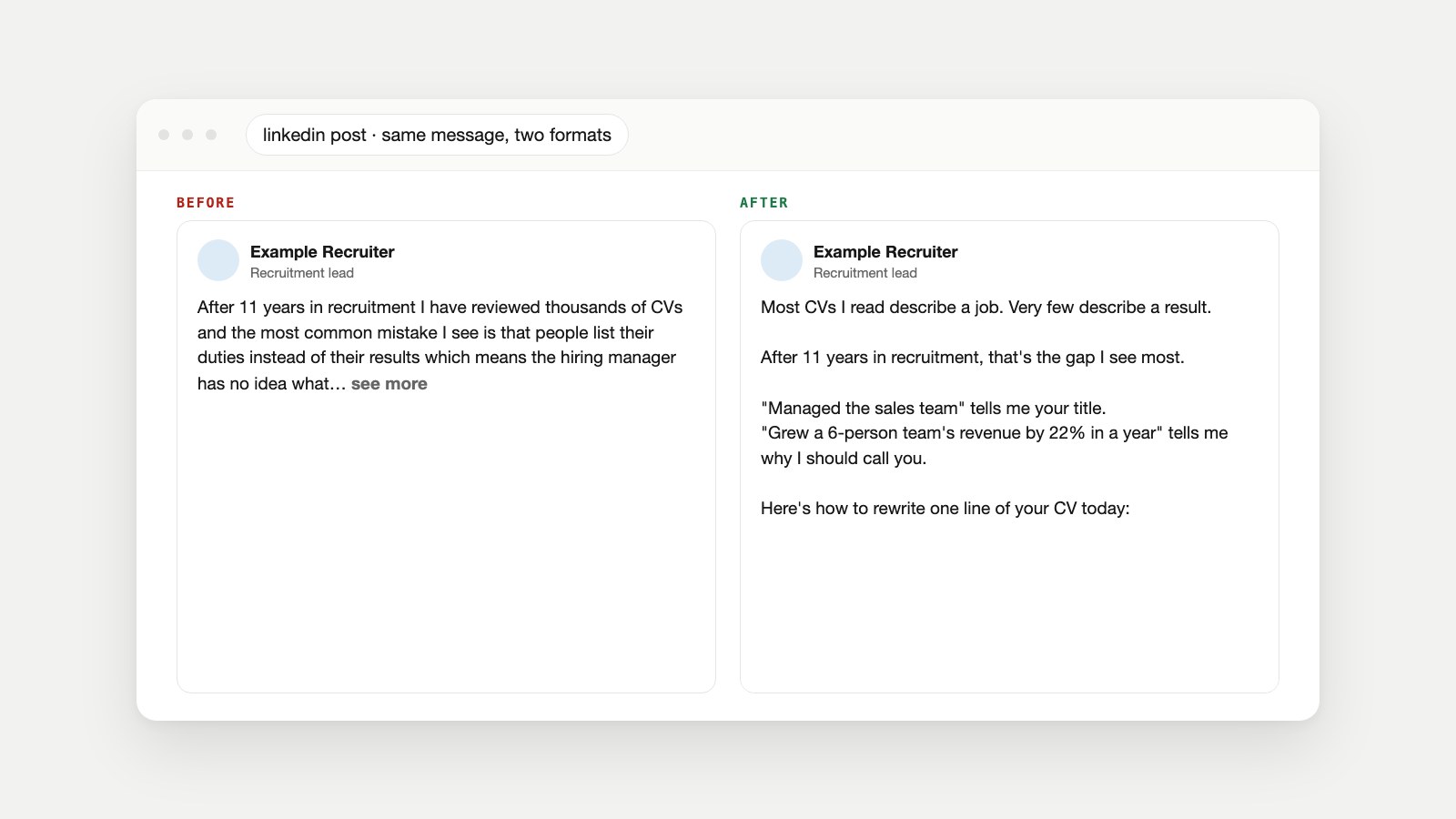
Here's an example post from a recruiter, written the way many first posts are: one block of text with the point buried in the middle.
After 11 years in recruitment I have reviewed thousands of CVs and the most common mistake I see is that people list their duties instead of their results which means the hiring manager has no idea what they actually achieved, so in this post I want to share how to rewrite your experience section so that every line shows impact, starting with the numbers you already have but never think to include...Nothing in it is wrong. But in the feed, readers see the first few lines, a run-on sentence about CVs, then "see more". Most scroll past. Here's the same message, formatted:
Most CVs I read describe a job. Very few describe a result.

After 11 years in recruitment, that's the gap I see most.

"Managed the sales team" tells me your title.
"Grew a 6-person team's revenue by 22% in a year" tells me why I should call you.

Here's how to rewrite one line of your CV today:

1. Pick a duty you listed.
2. Ask: what changed because I did it?
3. Add the number, even a rough one.

You already have the results. They're just written as duties.

What's one line on your CV you could rewrite this week?
Same writer, same idea, roughly the same length. Six formatting moves made the difference, and they're the rest of this guide.
Move 1: Write the Hook for the "See More" Line
LinkedIn shows the first few lines of a post in the feed and hides the rest behind "see more". The exact cut-off depends on the device and screen, so assume readers see one or two short lines. Those lines are your hook. A good LinkedIn hook does one of three things:
- Names a problem the reader has: "Most CVs I read describe a job."
- States a specific result: "We cut our hiring time from 41 days to 19."
- Makes a clear claim worth arguing with: "Cover letters aren't dead. Generic ones are."
Avoid hooks that answer themselves ("Our traffic fell. Turns out it was the redesign."), vague teasers ("This changed everything..."), and openers that only work as bait ("Comment YES and I'll send it"). Readers have seen them all.
Move 2: Use Line Breaks and White Space
LinkedIn keeps the line breaks you type in the post box. Use them. Give each idea its own short paragraph, usually one to three sentences, with a blank line between paragraphs. On a phone, a three-line paragraph already fills much of the screen.
A few habits make this easier:
- Write it first somewhere else (a notes app or document), then paste it in, and check the preview before posting.
- Don't break every sentence onto its own line. A post made only of one-line fragments reads like a list of slogans. Mix single lines for emphasis with short paragraphs.
- Read it on your phone before posting. That's how most people will see it.
Move 3: Add Emphasis Without Fake Bold
This is the question most people search for: how do you bold text on LinkedIn? In a regular post, you can't. The post box has buttons for emoji, media, events, polls and documents, but none for bold or italic.
So-called LinkedIn post text formatters work around that. They replace each normal letter with a look-alike character from Unicode's Mathematical Alphanumeric Symbols block, a set of bold, italic and script alphabets created for mathematics. It looks bold, but it isn't text formatting; it's a different set of characters.
That has costs. In accessibility specialist Adrian Roselli's 2025 screen reader tests, JAWS announced each fake bold or italic letter individually, with its case and style, while NVDA, VoiceOver and Narrator didn't announce the styling at all. A braille display user reported placeholder characters instead of words. Because the characters are different from normal letters, search and copy-paste may not match them either.
| Method | How it looks | Screen readers | Our advice |
|---|---|---|---|
| Fake bold (Unicode formatter) | Bold-looking letters | Can be read letter by letter, or with styling lost | Avoid, or use for one or two words at most |
| Its own line | Stands out through white space | Read normally | The best default |
| CAPITALS for one word | Loud | Read normally | Sparingly |
| "Quotation marks" | Marks a phrase or example | Read normally | Good for examples and before/after lines |
| Numbers and specifics | Draws the eye | Read normally | Use whenever you can |
If your company page or personal brand is held to accessibility standards, skip fake bold entirely. White space and specific words do the job without excluding anyone.
Move 4: Structure Lists and Steps
Lists make posts scannable. LinkedIn doesn't format lists for you, so type them as plain text: numbers for steps ("1.", "2.", "3.") and a simple dash or a single consistent symbol for unordered points. If you use emoji as bullets, keep to one kind and a few of them, because each emoji has a spoken name that screen readers read aloud.
Keep each list item to one line where possible, and introduce the list with a sentence that says what it is, as the recruiter's post does with "Here's how to rewrite one line of your CV today."
Move 5: Handle Links, Mentions and Hashtags
- Links: paste the full link on its own line, near the end, so it doesn't interrupt the story. Check the preview card first; if the image or title is wrong, fix the page's Open Graph tags (our Open Graph guide explains how, and the Open Graph Checker shows what LinkedIn will display). Tag links to your own site with the UTM Builder to see which posts send visitors.
- Mentions: type @ and choose the person or company from the list. Mention people when they're genuinely part of the post, not to borrow their audience.
- Hashtags: a few specific ones at the end, not a wall of them mid-post.
- Images: if you attach a photo or chart, describe it in its alt text so screen reader users get the same information. WebAIM's guide to writing alternative text shows how, and our image SEO guide has examples.
- Brand partnerships: if a post is paid or sponsored, LinkedIn has a Brand Partnership toggle in the post settings to label it.
Move 6: End With a Takeaway, Then One Question
The last lines decide whether the post feels finished. State the takeaway plainly ("You already have the results. They're just written as duties."), then, if you want comments, ask one specific question that's easy to answer from experience. Skip "Agree?" and "Thoughts?": they invite reactions rather than real replies.
Formatting Mistakes That Lose Readers
- A long first sentence. If the hook runs past the "see more" cut, readers never reach the point.
- A wall of text. One dense paragraph is hard to read on a phone, however good the idea.
- One-line fragments all the way down. Breaking every sentence onto its own line turns a post into a list of slogans.
- Whole sentences in fake bold. Look-alike bold characters can be read letter by letter by some screen readers, and a full sentence of them is hard for anyone to scan.
- A wall of hashtags or emoji. A few specific hashtags at the end help; a block of them looks like spam and each emoji is read aloud by screen readers.
- Several asks at once. "Like, comment, share, follow and DM me" dilutes all of them. Pick one.
- A link card nobody checked. A missing image or wrong title makes a good post look careless. Check the preview before posting.
- Writing straight into the post box. It's easy to lose a draft or miss a typo. Draft elsewhere, or save it as a LinkedIn draft, and read it once on your phone.
A LinkedIn Post Template You Can Copy
Paste this into your notes app, replace each bracket, and delete the brackets. The structure mirrors the recruiter's post: hook, credibility, idea, proof, steps, takeaway, question.
[Hook: one line that names a problem or a surprising result]

[Line 2: why you're the person saying it]

[Short paragraph: the core idea, 2–3 sentences]

[Proof: an example, a number or a quick story]

[List, if you have steps]
1. ...
2. ...
3. ...

[Takeaway: what to do or think differently]

[Optional question to invite real replies]

#OneTopic #TwoTopic #ThreeTopic
At around 150 to 250 words, a post like this is long enough to make a real point and short enough to read in the feed. Our LinkedIn Owl builds posts on the same shape, aiming at 200 words in four checked beats, if you'd rather start from a researched draft than a blank box.
LinkedIn Post Formatting Limits and Settings
| Item | What to know |
|---|---|
| Character limit | Up to 3,000 characters per post. For longer pieces, LinkedIn suggests writing an article. |
| Bold and italic | No buttons in posts. Look-alike Unicode characters are the only workaround. |
| Line breaks | Kept as you type them in the post box. |
| Drafts | You can save a draft and finish it later, including on another device. |
| Scheduling | Posts can be scheduled from the post box with the clock icon. |
| Who can see and comment | Set per post: Anyone, Connections only, or a Group; comments from Anyone, Connections only, or Off. |
| Posting volume | LinkedIn may limit visibility for excessive posting or posts made with automation tools. |
All of the above is from LinkedIn's help page on posting and sharing updates.
Check Before You Post
- The first one or two lines work on their own as a hook.
- Each paragraph holds one idea, with blank lines between them.
- Fake bold is used for two words or fewer, or not at all.
- Lists are plain numbers or one consistent symbol.
- Links are on their own line, with a correct preview card.
- The post ends with a clear takeaway and at most one question.
- You've read it on your phone.
LinkedIn Formatting Questions
How do you bold text in a LinkedIn post?
LinkedIn posts have no bold button. Text formatters replace letters with look-alike Unicode characters that appear bold, but some screen readers read them letter by letter, so use them for a word or two at most, or not at all.
Is it okay to use a LinkedIn text formatter?
Sparingly. The styled characters aren't real text formatting, which can make them hard for screen reader users and may stop them matching searches. White space and specific wording are safer ways to add emphasis.
What is the character limit for a LinkedIn post?
3,000 characters. For anything longer, LinkedIn suggests publishing an article instead.
How do I add line breaks to a LinkedIn post?
Press Enter in the post box; LinkedIn keeps the breaks you type. Writing the post in a notes app first and pasting it in makes spacing easier to control.
How long should a LinkedIn post be?
Long enough to make one point well. We aim for about 150 to 250 words, but the hook and clarity matter more than the count.
How many lines show before "see more"?
Only the first few, and the exact cut-off varies by device. Write as if readers will see one or two short lines before deciding to expand.
Should I use emoji in LinkedIn posts?
A few can help as markers, but each emoji has a spoken name that screen readers read aloud, so keep them few and consistent.
Can I schedule a LinkedIn post?
Yes. In the post box, click the clock icon to pick a date and time, and manage scheduled posts from the same place. You can also save a post as a draft and finish it later, even on another device.
Can I italicize text on LinkedIn?
Not with a button in posts. Italic look-alike characters have the same accessibility drawbacks as fake bold, so quotation marks are usually a better way to set a phrase apart.
The Pages Behind This Guide
- Post and share updates, LinkedIn Help, checked October 17, 2026.
- Mathematical Alphanumeric Symbols (U+1D400–U+1D7FF), The Unicode Consortium code chart.
- Don't use fake bold or italic in social media, Adrian Roselli, March 2025.
- Alternative text, WebAIM.