Key Takeaways
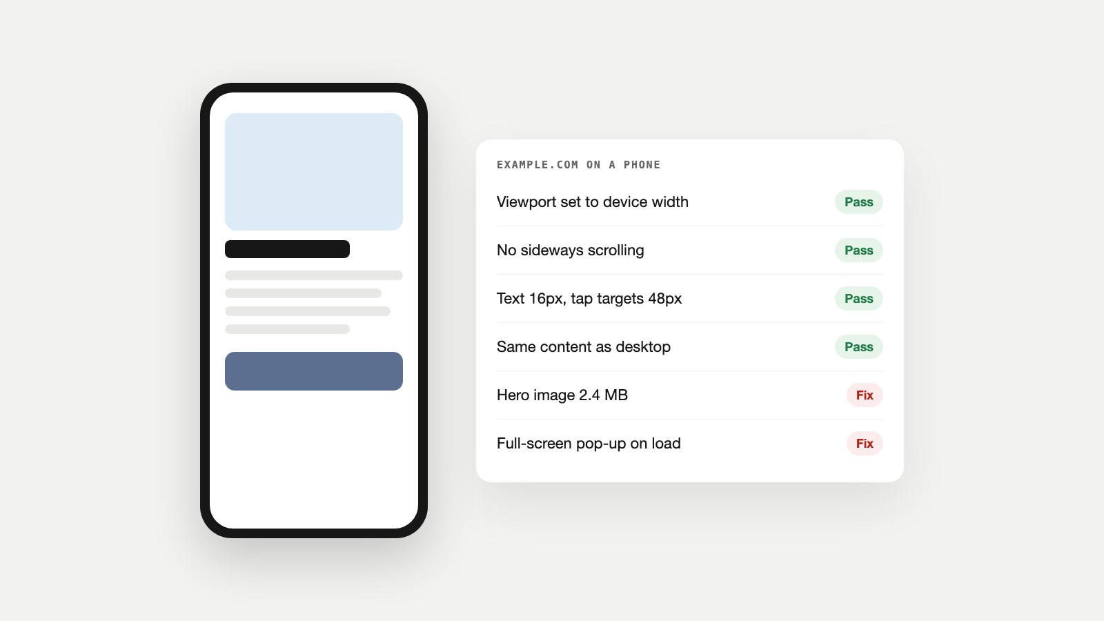
- A mobile-friendly website fits the screen, has readable text and easy-to-tap buttons, loads quickly on a phone and shows the same content as on desktop.
- Google crawls and indexes sites with a smartphone crawler. Since July 2024, Google says content that isn't accessible on mobile at all can't be indexed.
- Google retired its Mobile-Friendly Test in December 2023. Check pages with a free mobile checker, Lighthouse in Chrome and, always, a real phone.
- Start with the four fixes that break the most pages: the viewport tag, a responsive layout, readable text and tap targets, and heavy images.
What Is a Mobile-Friendly Website?
A mobile-friendly website is one that works as well on a phone as on a computer: it fits the screen without zooming or sideways scrolling, its text is readable, its buttons are easy to tap, it loads quickly on a mobile connection, and it shows the same information and features as the desktop version.
People often use mobile-friendly and responsive interchangeably, but they aren't quite the same. Responsive design is one way of achieving mobile-friendliness, and it's the method Google recommends because the same page and URL serve every device:
| Approach | How it works | Good to know |
|---|---|---|
| Responsive design | One page and URL; the layout adapts to the screen with CSS | Recommended: easiest to maintain and crawl |
| Dynamic serving | One URL; the server sends different HTML to phones | Needs the Vary: User-Agent header; easy to get wrong |
| Separate mobile site (m.example.com) | Different URLs for phones | Twice the work; content and metadata must match |
| Desktop-only site | One fixed layout, shrunk on phones | Not mobile-friendly: tiny text and pinch-zooming |
A responsive site can still fail on mobile, though: a 3 MB hero image, a full-screen pop-up or buttons crammed together all make a "responsive" page frustrating to use. Mobile-friendly is about the experience, not just the layout.
Why Mobile-Friendliness Matters for SEO and Sales
Google sees the mobile version of your site, so the mobile version is the one that gets indexed and ranked. Google announced in October 2023 that mobile-first indexing had landed across the web, and its June 2024 update went a step further: after July 5, 2024, "if your site's content is not accessible at all with a mobile device, it will no longer be indexable." The Mobile-Friendly Checker page explains mobile-first indexing in plain words.
Two things follow. First, anything you hide on phones (a section collapsed out of the HTML, a table dropped from the mobile template) is invisible to Google. Second, the mobile experience is part of Google's page experience guidance, alongside Core Web Vitals, HTTPS and the absence of intrusive pop-ups.
The business case is even simpler. Many customers will only ever see your site on a phone, often while deciding whether to call, book or buy. If the phone number isn't tappable, the form is fiddly or the page jumps around as it loads, they go back to the search results and choose someone else.
How to Check If Your Website Is Mobile-Friendly
Google retired its Mobile-Friendly Test and the Mobile Usability report on December 1, 2023, saying mobile usability still matters and pointing site owners to other tools such as Lighthouse. These are the checks to use now:
- A free mobile-friendly checker. Our Mobile-Friendly Checker loads a page as a phone would and checks the viewport, zoom settings, content missing on mobile and layout shift, then runs Google's mobile speed test.
- Lighthouse and PageSpeed Insights. Open DevTools, choose Lighthouse, select Mobile and run a report, or use PageSpeed Insights for real-visitor data too (how to read PageSpeed Insights). Lighthouse scores performance, accessibility and best practices, and lists specific fixes.
- Chrome DevTools device mode. Click the phone icon in DevTools to preview the page at common phone sizes, including tap targets and font sizes.
- A real phone. Nothing replaces it. Open your key pages on an older, smaller phone over mobile data: try the menu, fill in the form and tap the phone number.
We ran our own homepage through our checker: it loads on phones with HTTP 200, the viewport is set to the device width, phones get the same content as desktop, and every image declares its size so the layout doesn't jump. Those four passes are the baseline every page should hit before you worry about speed scores.
How to Make Your Website Mobile-Friendly: 12 Fixes
Work through these in order. The first four fix most of the problems people notice.
- Add the viewport meta tag. Without it, phones render your page at desktop width and shrink it down. Put this in every page's
<head>(MDN explains the options), and don't disable zooming withuser-scalable=no, which locks out people who need to enlarge text.
<meta name="viewport" content="width=device-width, initial-scale=1">- Use a responsive layout. Let columns stack on narrow screens with CSS media queries or flexible grids, and never give containers a fixed pixel width. web.dev's responsive design basics walk through the techniques. Two lines prevent most overflow problems:
img, video, iframe { max-width: 100%; height: auto; }
@media (max-width: 600px) { .columns { flex-direction: column; } }- Make text readable without zooming. A base font size of about 16px with comfortable line spacing works for body text, and keep lines short enough to read on a narrow screen.
- Make tap targets big enough. web.dev recommends touch targets of about 48 by 48 pixels, spaced about 8 pixels apart. The accessibility standard WCAG 2.2 sets a minimum of 24 by 24. Small links side by side in a footer or menu are the usual offenders.
- Remove sideways scrolling. Wide tables, long URLs, fixed-width embeds and oversized images push the page wider than the screen. Wrap tables in a scrolling container and let long words break.
- Compress and resize images. Images are usually the heaviest part of a mobile page. Serve them at the size they're shown, in WebP or AVIF, and use
srcsetso phones get smaller files. The Image Size Checker finds the heavy ones on any page. - Avoid intrusive pop-ups. Full-screen interstitials that cover content as soon as someone arrives from search are called out in Google's guidance on intrusive interstitials. Cookie notices and age checks required by law are fine; a newsletter pop-up on page load isn't.
- Keep the same content on mobile. Google's mobile-first indexing best practices say to make sure the mobile site contains the same content as the desktop site. You can rearrange it, using tabs or accordions, but keep it in the HTML.
- Keep the same titles, metadata and structured data. The same guidance asks for the same title, meta description, robots tags and schema markup on mobile. A different robots tag on mobile can stop a page being indexed. Check titles with the Meta Tag Checker and structured data with the Schema Markup Checker.
- Don't hide primary content behind interaction. Google won't click, swipe or type to load content, so lazy-load images further down the page if you like, but never the main content.
- Hit the Core Web Vitals targets. Our guide to what Core Web Vitals are explains each one; web.dev's Core Web Vitals set the bar for a good experience: Largest Contentful Paint within 2.5 seconds, Interaction to Next Paint of 200 milliseconds or less, and Cumulative Layout Shift of 0.1 or less. Give every image and embed a width and height to stop layout shift, and cut scripts you don't need.
- Simplify forms and calls to action. Use the right input types (
type="tel",type="email") so phones show the right keyboard, keep forms short, and make phone numbers tappable withtel:links.
Making It Work on Your Platform
Most site builders use responsive themes by default, so the work is usually in the content you add, not the layout itself:
- WordPress: choose a responsive theme, then check custom blocks, sliders and page-builder sections on a phone; builders such as Elementor have separate mobile settings for spacing, font size and visibility.
- Wix: use the mobile editor to adjust how each section looks on phones, and check that elements you hid on mobile aren't content you need indexed.
- Shopify and Squarespace: current themes and templates are responsive; check product image sizes, app pop-ups and any custom code sections.
- Canva websites and simple builders: preview the mobile view before publishing, keep text as real text rather than images, and test every button.
- Hand-coded HTML: add the viewport tag, use relative units and media queries, and test with Lighthouse before every release.
Common Mobile Problems and How to Fix Them
| Problem | Why it matters | Fix |
|---|---|---|
| No viewport tag | The page renders at desktop width and shrinks | Add the viewport meta tag to every template |
| Text too small | Visitors have to pinch and zoom | Use a base font of about 16px |
| Tap targets too close | People tap the wrong link | Make targets about 48px and space them out |
| Content wider than the screen | Sideways scrolling hides content | max-width: 100% on media; scrollable tables |
| Heavy images | Slow loading on mobile data | Resize, compress, use WebP/AVIF and srcset |
| Pop-up on page load | Blocks the content people came for | Delay it, shrink it or remove it |
| Content hidden on mobile | Google can't index what isn't there | Keep it in the HTML; rearrange instead |
| Layout jumps while loading | Mis-taps and a poor CLS score | Set width and height on images and embeds |
Mobile-Friendly Pages and AI Search
The same habits help with AI assistants. Google's AI Overviews draw on the same index, which is built from the mobile version of your pages, and most AI crawlers read your raw HTML rather than clicking through menus or running JavaScript. Content that is genuinely on the page, in the HTML, on every device, is content both search engines and AI systems can find and quote. Our guide to what an AI crawler is explains what those bots can and can't see, and our guide to why a page isn't indexed covers what to do when a page is missing from Google altogether.
Stop Mobile Problems Coming Back
Mobile problems creep back with every new page, plugin and pop-up, so check regularly rather than once:
- Test new templates and landing pages on a real phone before launch.
- Re-run the Mobile-Friendly Checker on your top pages after theme or plugin updates.
- Let Watch Owl crawl the whole site in a real browser and flag mobile viewport and parity problems, broken links and console errors on every page.
- Ask Owl-gorithm Hacker for a technical SEO audit when you want how pages render on different devices, indexing and on-page issues checked together, and Opportunity Owl to turn what it finds into specific fixes.
FAQ
What makes a website mobile-friendly?
It fits the screen without zooming or sideways scrolling, has readable text and easy-to-tap buttons, loads quickly on a phone, avoids intrusive pop-ups and shows the same content as the desktop version.
Is responsive design the same as mobile-friendly?
Not quite. Responsive design is a technique that makes one page adapt to every screen, and it's the approach Google recommends. A responsive page can still be unfriendly on mobile if it's slow, cluttered with pop-ups or has tiny buttons.
How do I check if my website is mobile-friendly?
Use a free mobile-friendly checker, run Lighthouse in Chrome with the Mobile setting, preview the page in Chrome DevTools device mode, and always test on a real phone.
Is Google's Mobile-Friendly Test still available?
No. Google retired the Mobile-Friendly Test and the Mobile Usability report on December 1, 2023, and pointed site owners to tools such as Lighthouse instead.
Does mobile-friendliness affect SEO?
Yes. Google indexes the mobile version of your pages, so content missing on mobile isn't indexed, and mobile usability is part of Google's page experience guidance.
What viewport meta tag should I use?
Use <meta name="viewport" content="width=device-width, initial-scale=1"> in every page's head, and don't disable zooming.
Do I need a separate mobile website?
Usually not. A single responsive site is easier to maintain, gives every visitor the same URL and avoids the content and metadata mismatches that separate mobile sites often have.
What is the best font size for a mobile website?
About 16px for body text is a common, comfortable baseline, with larger sizes for headings and enough line spacing that text isn't cramped.
Start With Your Most Important Page
Open your best-converting page on a phone, run it through the Mobile-Friendly Checker, and fix whatever fails first, usually the viewport, image weight or a pop-up. Then move on to the next page. While you're there, check the page's meta title and description and its redirects are in order. For a wider plan, our guide to AI marketing for small business shows how a well-built site fits into everything else.
Sources
- Mobile-first indexing has landed, Google Search Central Blog, October 2023.
- Mobile indexing vLast final final (1).doc, Google Search Central Blog, June 2024.
- The role of page experience in creating helpful content, Google Search Central Blog, April 2023.
- Mobile site and mobile-first indexing best practices, Google Search Central.
- Understanding page experience in Google Search results, Google Search Central.
- Avoid intrusive interstitials and dialogs, Google Search Central.
- Web Vitals, Responsive web design basics and Accessible tap targets, web.dev.
- Viewport meta tag, MDN Web Docs.
- Understanding SC 2.5.8: Target Size (Minimum), W3C WCAG 2.2.
- Lighthouse overview, Chrome for Developers.